
Thank you for reading!
If would you like us to create a high-converting website for you, Click here.

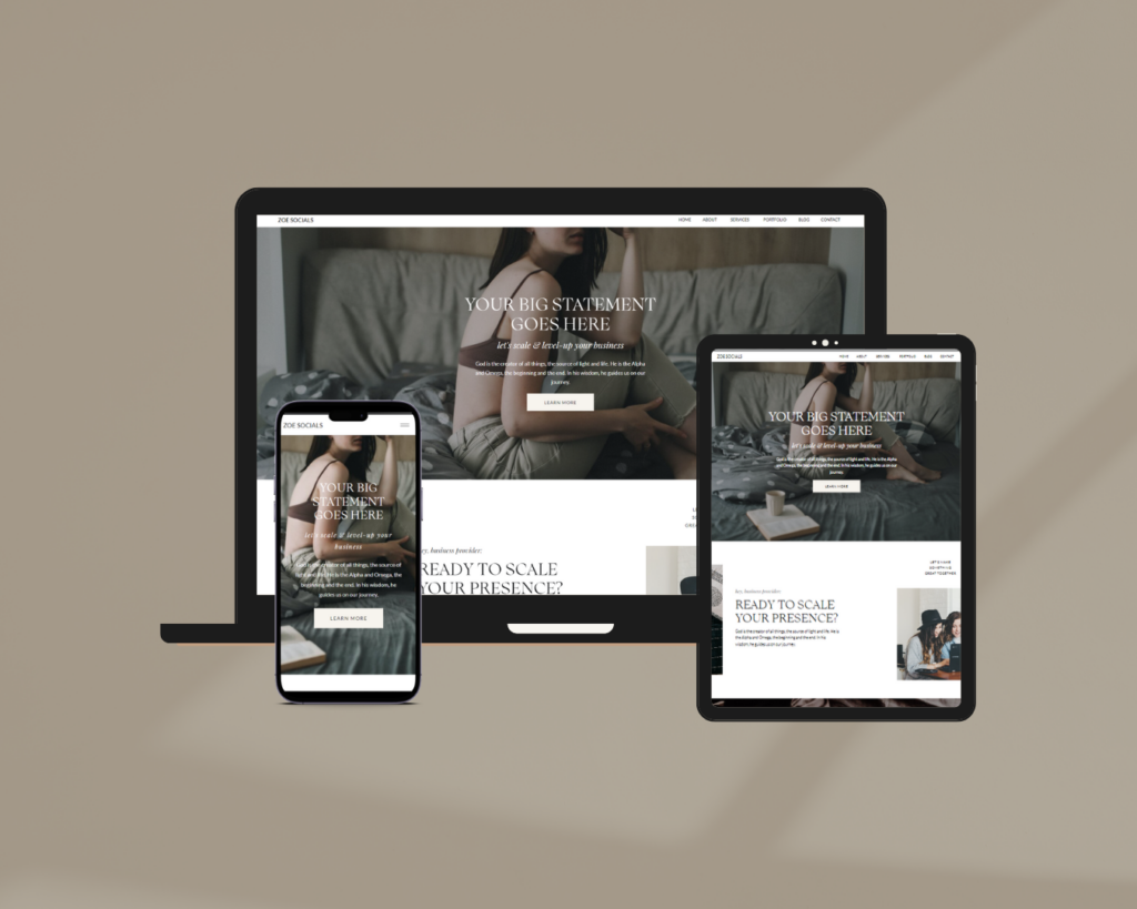
Responsive web design is crucial for creating user-friendly websites that adapt seamlessly to various devices and screen sizes. By implementing responsive design principles, such as fluid grids and flexible images, you can enhance user experience, improve accessibility, and boost your website’s search engine rankings.
In this article:
- Understanding Responsive Web Design
- Elevating User Experience through A Responsive Web Design
- The Mobile-Friendly Advantage
- Why A Responsive Web Design Matters
- The Future of Responsive Web Design
Responsive website design has become an essential aspect of creating a user-friendly online presence. It’s crucial for websites to adapt seamlessly to provide optimal user experiences. Responsive web design ensures that your website looks great and functions flawlessly across all devices, improving accessibility and engagement. In this article, we’ll explore the significance of responsive web design and its impact on user experience, empowering you to create websites that captivate and satisfy your audience.
Understanding Responsive Web Design
Responsive web design refers to a design approach that allows websites to adapt and respond to different devices and screen sizes. It ensures that your website looks great and functions optimally, regardless of whether it’s accessed from a desktop computer, a tablet, or a smartphone. With the increasing popularity of mobile devices, having a responsive website is no longer a luxury but a necessity.
One of the key principles behind responsive web design is fluid grids. Instead of fixed-width layouts, fluid grids adjust and proportionally resize elements based on the user’s screen size. This flexibility ensures that your website maintains its visual integrity and readability, no matter how large or small the display.
Moreover, responsive web design uses flexible images and media queries to optimize images and videos for different screen resolutions. By dynamically adjusting the size and resolution of images, you can reduce page loading times on mobile devices while maintaining visual quality. This leads to a seamless browsing experience for your users, regardless of the device they’re using.
Elevating User Experience through A Responsive Web Design
User experience is at the core of every successful website. A positive user experience not only engages visitors but also encourages them to stay longer, explore more, and ultimately convert into customers. Responsive website design plays a pivotal role in creating a user-friendly environment that keeps your audience satisfied and coming back for more.
One of the significant impacts of responsive web design on user experience is improved accessibility. With a responsive website, users can easily access and navigate your content on any device, without the need for excessive zooming, scrolling, or sideways swiping. This seamless experience enhances usability and reduces frustration, leading to increased engagement and a higher likelihood of achieving your website’s goals.
Furthermore, responsive web design positively affects your website’s search engine optimization (SEO). Search engines, such as Google, prioritize mobile-friendly websites in their rankings, as they aim to provide the best user experience. Having a responsive website not only ensures that you reach a wider audience but also improves your chances of ranking higher in search results. As a result, you can attract more organic traffic and increase your website’s visibility online.
The Mobile-Friendly Advantage
In today’s mobile-driven world, having a mobile-friendly website is no longer optional; it’s imperative. Mobile devices have surpassed desktops as the primary means of accessing the internet, making it essential for businesses to cater to this growing user base. A responsive website design allows you to create a mobile-friendly website that adapts seamlessly to various screen sizes and orientations.
A mobile-friendly website offers several advantages. Firstly, it provides a consistent brand experience across all devices, reinforcing your brand identity and credibility. Whether users are accessing your website on their smartphones during their daily commute or on their tablets while relaxing at home, they can enjoy a cohesive and immersive experience.
Secondly, a mobile-friendly website improves engagement and conversions. Studies have shown that mobile-friendly websites are more likely to convert visitors into customers, as users can easily navigate and interact with your content. By eliminating obstacles and ensuring a smooth browsing experience, you increase the chances of users taking desired actions, such as making a purchase or filling out a contact form.

Why A Responsive Web Design Matters
Website responsiveness goes hand in hand with responsive web design, ensuring that your website performs optimally across different devices. Responsiveness is not just about aesthetics; it’s about delivering a seamless user experience that keeps your visitors engaged and satisfied.
First and foremost, website responsiveness impacts your website’s loading speed. Mobile users expect fast-loading websites, and a responsive design helps achieve just that. By optimizing your website’s performance for mobile devices, you reduce the chances of visitors bouncing off due to slow loading times. Responsive design also reduces the amount of data that needs to be transferred, making your website more data-friendly for users with limited data plans.
Secondly, website responsiveness helps improve your website’s usability. Elements such as buttons, menus, and forms are optimized for touch interactions on mobile devices. This ensures that users can easily interact with your website, whether they’re using their fingers or a stylus. With intuitive and user-friendly interactions, visitors are more likely to engage with your content and achieve their desired goals.
The Future of Responsive Web Design
As technology continues to evolve, so does the world of responsive web design. With advancements such as foldable devices, wearable technology, and virtual reality, designers must stay ahead of the curve to deliver exceptional user experiences.
One exciting trend is the concept of adaptive design. Adaptive design takes responsiveness to the next level by tailoring the user experience based on the user’s device, context, and preferences. With adaptive design, your website can automatically adjust its layout, content, and interactions to match the specific needs and capabilities of each user.
Responsiveness for a Successful Website
Responsive web design remains a cornerstone of successful website development. By embracing the principles of responsiveness, you can create user-friendly websites that adapt to the needs of your audience, regardless of the device they use. The importance of a responsive site cannot be overstated, as it enhances user experience, boosts engagement, and sets your website apart in a crowded online world. So, invest in responsive web design and unlock the potential to create memorable, accessible, and engaging websites that leave a lasting impact on your visitors.
If you’re looking to elevate your brand to new heights of sophistication, our signature offer for luxury brand and website design is tailor-made for you. With my expertise in responsive website design and a keen eye for aesthetics, I can create a visually stunning and mobile-friendly website that perfectly complements your brand identity. By combining cutting-edge design trends with a focus on user experience, I’ll ensure that your website leaves a lasting impression on your exclusive clientele. Don’t miss this exclusive opportunity to elevate your online presence and position your brand as the epitome of luxury. Contact me today to embark on a transformative journey that will set your business apart.
Related Articles:
Responsive Web Design: What You Need to Know
category

